Background
Web design taps into the human mind more than any other profession. You have to think about the way other people perceive colors, design, patterns, etc. Humans don't like too many, too little, too much, and so many other things that need to be taken into account. This post is going to be dedicated to a lot of do's and don'ts in web design. Well, let's get on with it, then!Excessive Background
There are many websites that are more normally used that actually have bad backgrounds that make too much noise, but I think that this is a prime example of what not to do with the background. It takes up so much attention which makes everything else look more like the background. Now this isn't the only web design sin this exhibits (not by a longshot), but I feel like the background is probably (one of) the worst parts of it.
Competing Noise
Now, I did use this with my last post, but I think it works here very well. There's a lot going on here and I really just don't know what I want to look at right away. Everything kinda competes with itself but is also a similar color so I sometimes can't even tell what they're trying to put my focus on. While not a bad website by any means, I sometimes just don't really know what it wants from me.
Not Obviously Clickable
 Amazon, one of the most prominent websites for eBuying, has a problem with what is really clickable. Almost everything is just images which might be hard to realize what is actually clickable. It's tough to differentiate what you actually can click, especially if you don't know much about computers and don't know that you can add links to images. While not awful, it is a little nit-picky but also is a problem that they have.
Obviously Clickable
 This is something you really wanna strive for. Twitter has text next to almost everything or on everything that's clickable. That makes it simple for the end users and they never have to put any guesswork into play. Simple and sleek, this is probably the best way you should use the click-ability rule.
 Clearly Defined Areas
Much like the newspaper proper, NYT does a good job in dividing everything up into bite size little pieces. From little quips from larger stories on the right, to larger more major stories in the middle. The right side is a bit less about news and more about just general life or opinions. Everything has a place and they all fit into their homes very well.
Not Clearly Defined Areas
Now don't get me wrong, I LOVE Google. However, everything on this page just kinda seems like it's... there. That isn't really a bad thing, Google does a good job of it, but that doesn't change the fact that everything if floating. Now the lack of area can be done quite well, but it's something much harder to pull off as opposed to good use of area.
Good Use Of Visual Hierarchy
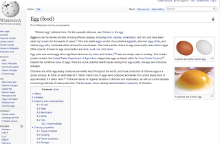
You can really tell what is most important on each page. The header is large, the sub headings are average, and the text is normal. It all feels like how any website, especially one like wikipedia, should work. It does an amazing job at creating a good hierarchy so you can tell what is most important on any given page.
Good Use of Conventions
Just to prove my love for the A-Z shopping site, Amazon has some amazing use of conventions. Amazon even MADE some conventions that we still use today. See that shopping cart in the corner? Amazon did that first. It does a great job using the conventions to great use. Good on you, Amazon, good on you.


No comments:
Post a Comment